
Typography plays a crucial role in shaping the visual appearance and user experience of a website. It involves choosing appropriate fonts, establishing a hierarchy for different types of content, and creating a consistent visual appeal throughout the site. This series of articles will explore key aspects of typography.
In this first overview into typography, we will explore specifically font families. These are collections of ways a font can appear. Not all browsers support all fonts. If someone’s browser cannot render the font you choose, it can instead load a font within the family to provide a similar visual experience.
This is one in a multi-part deep dive into web design typography. For others-
Part Two: Font Colors | Part Three: Text Sizing | Part Four: Spacing
What We'll Cover
What is Typography?
Typography is the art and technique of arranging text to make written language legible, readable, and visually engaging. It involves careful decisions about font selection, size, spacing, color, and layout. This shapes the look and feel of your content. Whether on a website, in print, or on mobile apps, typography is a foundational design element that can strengthen brand identity, improve user experience, and guide readers through information smoothly.
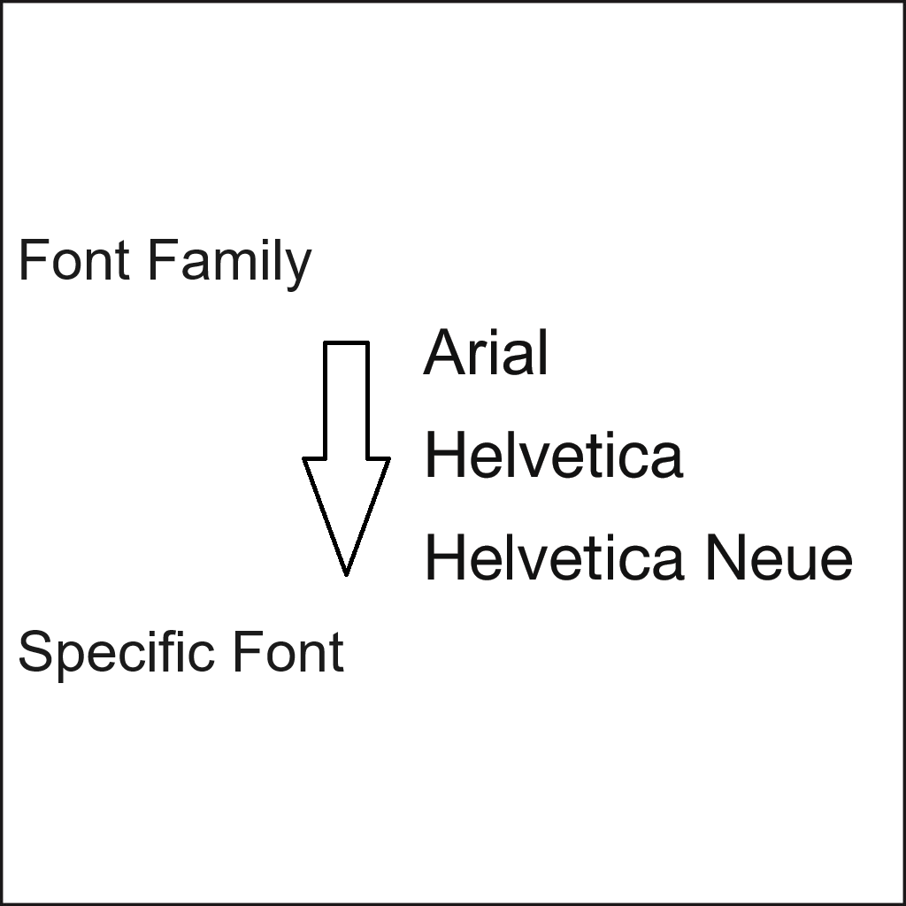
Font Families Crash Course
Font families refer to a group or collection of related fonts that share a similar design style and characteristics. A font family typically includes certain styles and variations, such as regular, bold, italic, and condensed, within a specific typeface.
These fonts in a family are visually cohesive, allowing for consistency while providing flexibility in typographic choices. Each font style within a font family has its own distinct attributes but shares a common underlying design.
For example, a font family like “Helvetica” may include variations such as “Helvetica Regular,” “Helvetica Bold,” “Helvetica Italic,” and “Helvetica Condensed.” These different styles within the font family retain the core visual characteristics of Helvetica but offer options for different emphasis, weight, and style.
Font families can also establish visual hierarchy, differentiate headings and body text, and create a cohesive design. By selecting fonts from the same family, you can ensure a harmonious typographic presentation while utilizing variations to add emphasis or convey different levels of information.
Font families can be specified using CSS (Cascading Style Sheets) and are commonly used to define the font stack. The font stack lists font families in order of preference, allowing the browser to choose the closest match available on the user’s system.
Why the Font Family Matters
Font families are practical as well as aesthetic so planning requires weighing the impact of each. In web development, font families are defined using CSS to ensure consistent presentation across devices and browsers. An effective use of font family provides layers of fallback fonts in case the preferred font isn’t available on the user’s system. This ensures your site still appears polished and legible, in the general style you want, regardless of platform or device.
Making your Font Choice Flexible
Specifically, using font families over a single font will help your website keep its look and feel even if the user’s browser does not support your preferred font type. For example, “Helvetica Neue” can be the preferred font, followed by “Helvetica” as an alternative, and then “Arial” as a backup. If none of these fonts are available, the browser will default to a generic sans-serif font.
Font families provide flexibility, allowing for fonts that align with the website’s style and purpose. They also maintain visual consistency across different devices and platforms, which may not be able to render the preferred font. When you create the css version of a backup plan, you get a chance to define the alternative. Some choices are better than others and better align with what you had in mind for the font. So, while font families offer you flexibility, consistency (keeping all the fonts serif or non serif) should be a priority. That’s why there are many font “families” that are similar to one another but slightly different.
Planning Tips for Effective Typography
1. Prioritize Readability
Avoid overly stylized fonts for body text. Choose typefaces with clear letter-forms and appropriate spacing, especially for longer paragraphs.
2. Pair Fonts Thoughtfully
Use one font family for body text and another for headings, or stick with one family and vary the weight/style. For example, pair Montserrat Bold for titles with Montserrat Light for text.
3. Use Typography for Visual Hierarchy
Size, weight, and spacing help guide users through content. Headlines should stand out, while body text should be comfortable to read.
4. Think Accessibility
Good typography supports inclusive design. Use sufficient contrast, avoid very thin fonts, and ensure line spacing is adequate. What might be a matter of convenience to one reader may be a necessity for another.
5. Stay Consistent
Set font rules in your style guide or CSS stylesheet and stick to them. Consistency builds brand trust and makes your site easier to navigate.
Current Trends
Staying ahead of typography trends ensures your design remains fresh and engaging. That said, going against the grain may help you stand out, and not every industry is adopting the same typographical trends. Here are some key attributes catching on in newer websites:
- Variable Fonts for Speed and Flexibility: These fonts improve load times and allow for dynamic adjustments, making them ideal for responsive design.
- Bold, Oversized Headlines: Large typography commands attention and improves readability, reducing bounce rates.
- Minimalist Sans-Serifs: Clean, simple fonts enhance user experience and mobile responsiveness.
- Custom Typefaces for Branding: Unique fonts help businesses establish a distinct identity.
- High-Contrast Typography: Sharp contrast between text and background improves readability and accessibility.
Be Deliberate
Typography is more than just font choice, it’s a communication tool. It is as important as layout and color scheme. Selecting the right font family ensures consistency and enhances brand identity. Whether designing a website, marketing materials, or social media graphics, typography should be intentional and aligned with your message.